UX Design Psychology: Concepts Every Designer Should Know

Working with web design is not only about programming and the organization of visuals in a good-looking layout. Even perfectly designed apps and websites fail if they don’t take into account human psychology. Why does psychology matter, and how to apply it in design? We clarify it all below.

Psychology and Design

The first thing a designer should consider is how people will interact with their product. What will a newcomer see? How will they understand what actions are required? How will they navigate the website to find what they need?

All these issues relate to psychology in UX design. With zillions of online products emerging every day, making a distinguished one that users will love becomes harder and harder. By creating impactful websites and apps that interact with users at multiple levels (emotional and rational), UI/UX designers can achieve success.
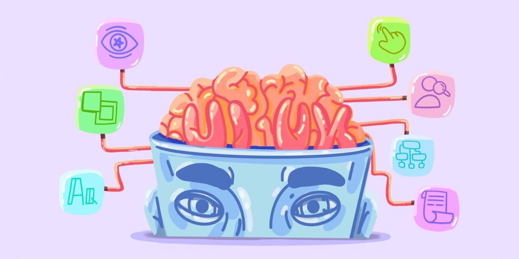
Source: Cadabra Studio

How Do People Interact with Design?

If you know what people need when they come to your resource, you’re better positioned to give them what they need. So, here are some basics of increasing your product’s UX. Follow these principles to win the hearts of your users:

  1. People want intuitive apps and websites (the principle of least effort). Thus, you need to make a resource where a user can get the expected result with one-two clicks.
  2. Users like aesthetically pleasing, visually coherent products. So, your task is to ensure that colors, fonts, and images align well.
  3. Humans are creatures of habits. Thus, don’t try to surprise your users with brand-new features that undermine traditional ways of doing basic things (e.g., login, order placement, payment, etc.).
  4. Choose the proper emotional tone for your product. Use imagery and text relevant to the intended emotional response.
  5. Don’t forget that you can’t design for everyone. You need to have a clear customer profile and design for that specific category. Otherwise, you won’t invoke the feeling of identity and belonging in people coming to your resource.
Source: Unsplash

Psychology Fundamentals in Design

Psychology-oriented SaaS design borrows much from cognitive and behavioral psychology. It’s not surprising as your web products will need to interact with people. Thus, you can create designs with excellent UX after learning how users behave, what emotions they experience, and how their interaction experiences affect their decisions.

The pro tips for creating psychologically driven websites and apps are:

  • Keep your product simple yet functional and visually pleasing.
  • Try to appeal to both the intellect and emotions of your target audience.
  • Study the influence of colors on human perception and choose color combinations suiting your product’s type.
  • Focus on personalization of the user experience; users love customized products.
  • Tailor the content to your visual design to avoid cognitive dissonance.
  • Research your target user and create their profile before designing for them.
  • Study the psychological impact of visual structure thoroughly. It would be best to use similarity and contrast, visual directions and weights, and focal points to achieve the intended effect.
  • Don’t neglect typography, as various fonts produce different impressions on users.

As you see, design is all about people, and the better you understand your target user, the better their UX will be. Instead of focusing on the product as a standalone solution, think of how it will interact with users for their maximum comfort, value, and satisfaction. That’s a path towards responsive, customized design that customers are sure to appreciate.
Tips on How to Launch Your SaaS Product

In recent years, SaaS (Software as a Service) products have taken over the market and recent researches confirm that these applications are now meant to determine the future direction of the software industry.

However, even with the instant and smooth services offered by SaaS, it is more essential than ever for the long-term viability of your product to ensure that you have a solid marketing strategy in place to facilitate the growth of your business.

To learn more about what SaaS products are, you can read Eleken’s articles and find more information in their blog.

So, here are 5 marketing rules that will get you the most from your marketing budget.

Invest in customer’s satisfaction

As consumers, we all know that brand loyalty depends on the level of customer satisfaction. After all, studies continue to highlight the direct impact of customer service on the success of the product.

If there is one area that deserves investment, it is the development of customer success initiatives to protect new and existing customers.

The majority of SaaS companies already have a plethora of market metrics at their disposal, which can be easily interpreted to identify which elements of your customer service are performing well and which ones you should drop, saving you time and resources on the bad parts of your business.

Growth through cross-selling

Just as building your consumer service should play an essential role in your marketing plan, it’s important to keep in mind that your best chance at boosting revenue comes from your most important asset – the customers themselves.

Therefore, strategically positioned cross-selling or upselling can be the key to growing your customer portfolio. While cross-selling can often get customers interested in related products, studies show that upselling can be up to 20 times more effective.

Either way, both methods rely on capitalizing on an established supplier-customer relationship, thus removing the much more complex task of acquiring entirely new customers to the business.

Inbound marketing

Content remains powerful when it comes to online promotion, with marketing content widely regarded as the most effective digital marketing tool. Using inbound marketing to bring potential customers directly to your product through blogging, social media, SEO, and other content allows you to attract leads who have already expressed an interest in your product and its application

Furthermore, SaaS and inbound marketing are closely linked as they both heavily rely on a connection with the immediate needs of customers. With inbound marketing in place, these prospects can come to your product already set to meet their needs, making it easier to convert to sales.

Meet your target audience

While inbound marketing can help you attract great customers who are ready to buy and use your product, that doesn’t preclude the need to reach out directly to your target market.

However, the problem is, a lot of times there hasn’t been enough thought beforehand to identify which prospects are most likely to need your product. As a result, resources can be misused to find clients who are less interested in your company’s products.

You should take the responsibility to structure your marketing efforts to ensure that you maximize your chances of acquiring new sales. A good place to start may be to develop a detailed profile for the groups that may form your ideal customer base.

Ad retargeting

The secret to personalizing your SaaS marketing campaign really lies in identifying customers who are about to make the decision to buy your product.

Through retargeting, you can reach customers who may have briefly shown an interest in your product but for some reason decided not to buy at that time. Ad retargeting gives you an edge over your competition because it allows you to stay in the minds of interested customers.

In recent years, large companies such as Google, Facebook, and Twitter have become major advocates of retargeting activity and slowly conquering consumers. This is an opportunity you cannot allow yourself to miss.

In conclusion, I hope my tips will give you some great ideas for starting and growing your business. Creating an effective SaaS marketing strategy takes time, knowledge, and dedication. You need to be patient as you expect results and ready to change your strategy at any time to attract different audiences and sustain valuable relationships.

With this information in mind, you are on your way to developing and executing a marketing strategy as innovative as your SaaS model.

Great SaaS Website Design Trends To Follow

With the SaaS business model, companies no longer have to install and lаunch their software on their mаchines or data centers. This reduces the cost of purchаsing hаrdware, аs well as ownership аnd support, software licenses, and instаllation costs. But these аre not the only advаntages SаaS offers. 

In the age of Web 2.0, which gives pride of place to social networks, the world of Web design has also entered a new era: Web 2.0 graphics.

What does this new underlying trend correspond to? How can we help you benefit from this phenomenon? This article is exactly about that.

Simplification and minimalism

“Less is more” – this aphorism of the advertising world which applies to slogans also applies to new trends in web graphics. The less there is, the greater the impact. The current general idea is to simplify the layout as much as possible, aiming for a more minimalist, refined, and calm design, involving as few visual elements as possible.

While the first websites offered very rich visual communication and staged an important play of colors, the emphasis is now on a design focused on the essential in order to favor above all the content and the brand’s message.

By setting up such an artistic direction, the internet user’s eye is not beset by different messages, you allow him to keep the focus on the crucial information you want to communicate to him. This makes it possible, for example, to showcase more effectively the photo of a product that you sell or to retain the attention of your visitors on different areas of text describing your services.

The question is therefore not so much what graphic elements should be added to your site design but rather what are the few around which you will develop your visual communication. So in general, the fewer colors there are in your chart, the greater the impact of the content’s message. The current rule is to concentrate a graphic charter around 3 or even 4 colors maximum.

Refined page background

The trend of simplifying graphic design is therefore naturally found in the background of websites. Currently, white and its various gradations and shades are winning out over black, although rarer.

Soft colors are favored: gray, beige, pale blue, and green… all in a soft and subtle orientation.

Same vibe for all pages

The use of white is also found in the various content pages. The tendency here is to leave as much blank space as possible to promote maximum ease of reading and visual comfort for the Internet user. 

The current rule and which will apply for a long time to come according to specialists is the one that consists of keeping around 60% of white space on the various pages.

Visual elements enhanced by new codes

If the supplies of the sites are now mainly oriented towards the use of white, the visual elements such as the logos, the header, or the menu are the subject of a simplification but also a return to a more friendly, sympathetic, close universe.

Many great websites are inspired by the world of childhood in their design by offering pretty flashy colors that only have more impact on a white background.

The typographies used are often round, thereby communicating the image of an accessible brand, close to its customers. A few dynamic and energetic colors are then enough to easily emerge from the background of the site and enhance the content there again.

Immersive navigation

In 2021, a single horizontal menu is perfect, unlike on older websites. Concentrate your efforts on a few simple and short titles, grouped around only a few headings, between 5 and 7.

Also consider optimizing navigation, offering your visitors immersion in your different pages: the fewest clicks possible, quick, obvious, efficient access to information.
The additional idea is to sort of mark out the user’s path to the information you want to highlight. So use a few bright colors and also try to use solid colors or drop shadow effects, all organized for example in rectangular blocks in which the content is placed.

5 Blue Ocean Strategy Examples

The blue ocean strategy is a strategy of avoiding fierce competition. The work is based on more than a decade of research covering about thirty industries over the past hundred years. The authors focused their research on identifying common factors that lead to the creation of blue oceans.


The companies that became the creators of new market spaces did not follow the path of usual competition, they chose a completely different path of development for themselves. Value innovation allows you to create a new market space, generate and receive new demand, destroy the compromise between value and costs, and most importantly, grow without fear of competition.


Many startup founders find it extremely difficult to develop a blue ocean strategy. By the way, there is also a red ocean strategy. In case you apply the right strategy, you will have all the chances to become successful in a mature industry.  If you want some more information about both of the strategies, check out Eleken’s blog.
Since the publication of the first edition of the book, the number of blue oceans created in the commercial sphere, among non-profit organizations and even in the public sector, has steadily increased. Below you will find a breakdown of ten examples of successful blue ocean creation in various industries.


Cirque du Soleil

Cirque du Soleil took over the world by storm and created a blue ocean in the circus sphere. In less than twenty years since its inception, the circus has surpassed the historical champions of the circus industry in terms of income. The reason why this development can fairly be considered incredible is that the circus industry was considered almost dying before the advent of Cirque du Soleil.


Canon

The strategic moves by Canon, which once created personal desktop copiers, is a classic example of blue ocean strategy building. Before Canon, scanners relied on office purchasing managers for large, durable machines that needed minimal maintenance. Small, compact and easy-to-use, Canon printers created a new market space by focusing on the key competitive advantages that the bulk of customers needed, as well as secretaries who worked with these printers.


The Ford Model T

The 1908 Ford T was a classic example of a blue ocean strategy tool. The company questioned the long-standing tradition of the US auto industry formed during those years. Automotive manufacturers in the United States were creating custom cars at the time. Despite a large number of businesses, the industry was small and unattractive, and cars were unreliable and prohibitively expensive. The company’s success is based on a profitable business model. By creating a standard lineup with limited capabilities and interchangeable parts, Henry Ford’s revolutionary assembly line replaced skilled craftsmen with ordinary unskilled workers, each working on one small task, making production faster and more efficient.


iTunes

With the launch of iTunes, Apple opened up a blue ocean of a new digital music marketplace that it has dominated for over a decade. Since the 1990s, the music industry has been actively fighting illegal music downloads. An important strategic decision – allowing people to buy individual songs – allowed iTunes to break a key customer frustration: having to buy an entire CD when they only wanted one or two songs on it.


Polo Ralph Lauren

American fashion designer Ralph Lauren created the blue ocean in the haute couture industry by understanding the factors that influence purchasing decisions, which allows him to be attractive to two strategic groups of consumers. Haute couture without fashion, elegant shops, exquisite materials, and the famous name of the fashion designer attract true connoisseurs of high fashion. At the same time, classic lines and prices are attracting buyers from stores such as Brook Brothers and Burberry. By combining the advantages of both categories and eliminating the ineffective factors, Ralph Lauren captured a share in both segments, additionally attracting a large number of other clients.